...
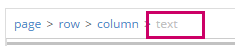
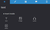
Most components are added within a column.

Rows and Columns
The basic components of any page are ROW and COLUMN.
...
12 is always 100% of the width.
Text // Quotations
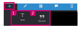
1.Texto
Occupies 100% of the page or column in which it is located. It does not have properties.
It is configured with its own editor CKEditor.
2.Quotations
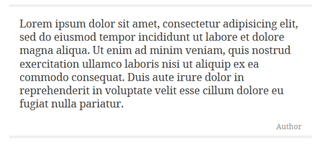
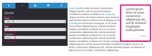
Component with two texts: body and author.
In its properties you can float the quotation to place it “in line” with text. The width it will occupy can be configured and it will be right- or left-aligned.
3.Images
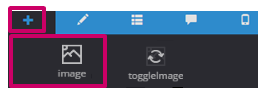
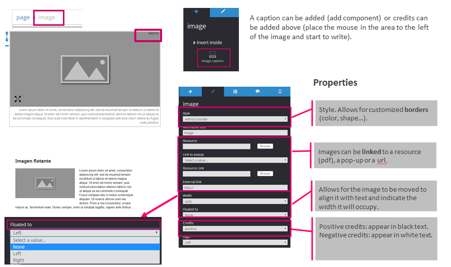
Image Exchanger // Before and After
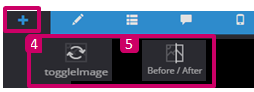
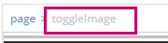
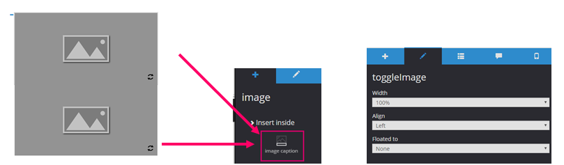
4.Image Exchanger
Allows for two related images to be added. When the user clicks on the first image, the second image is shown.
...
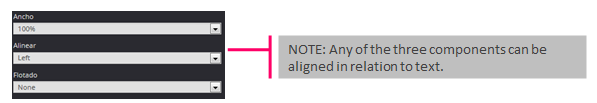
The width and placement of the component in relation to the text can be configured in properties.
5.Before/After
Allows for two related images to be added. When the mouse hovers over them, one of the two is displayed.
...
The width and placement of the component in relation to the text can be configured in properties.
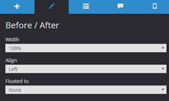
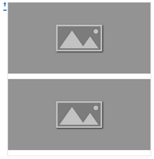
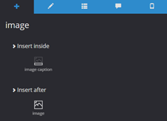
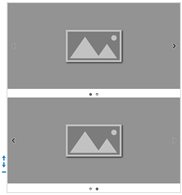
Image Gallery // Panel
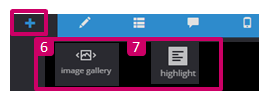
6.Image Gallery
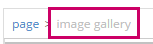
Series of images. Images can be added, and captions and credits can be added to each image. The properties of each image must be configured.
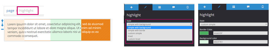
7.Panel
Area highlighted with color. Any component can be included within it (text, images, videos…)
The style can be defined under properties: simple (plain background) or striped. If options for customizations are selected, the background and border colors can be manually configured.
Accordion// Tab Group
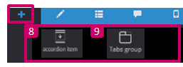
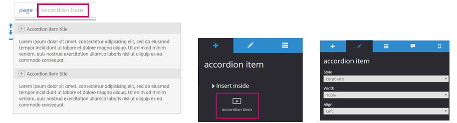
8.Accordion
Folding menu. If Customized style is selected under properties, the background color can be configured.
New options can be added (accordion elements). Any component can be added within each Element of the accordion.
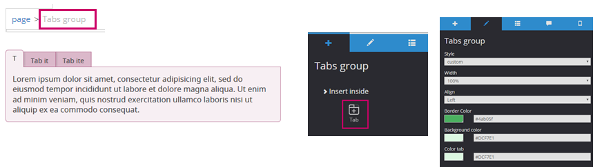
9.Tab Group
Tab menu. If Customized style is selected under properties, the background color can be configured. New options can be added (tabs). Any component can be added with each tab.
Audio // Video // YouTube
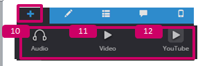
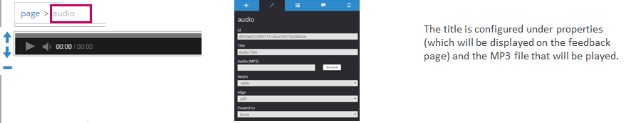
10.Audio
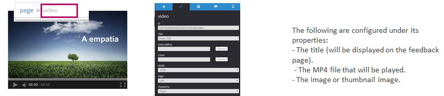
11.Video
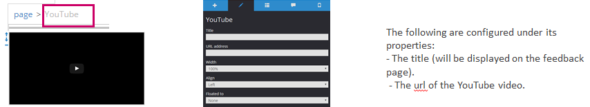
12.YouTube
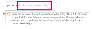
Non-Interactive Activities// External Animations
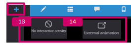
13. Non-Interactive Activities
Indented text that adds activity numbering.
...
Any component can be added within it.
14.External Animations
Allows for html5 animations to be embedded

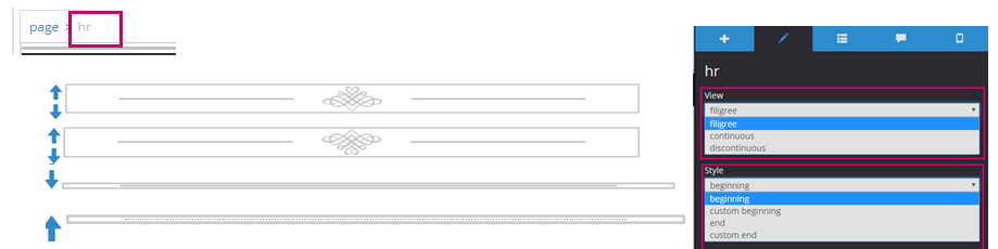
Dividers // Footnotes
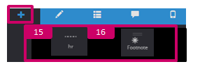
15.Dividers
Graphic text dividers. The appearance and style can be selected under properties.
16.Footnotes
- The reference is added.
- The Title is given under properties.
- It is linked to a text with “Footnotes”

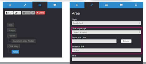
17.Click Maps
Interactive image. Select the image and click “Configure” to add clickable areas.
...
Select the areas created on the image, and under properties, indicate which element will be linked (pop-up, pdf, or url).
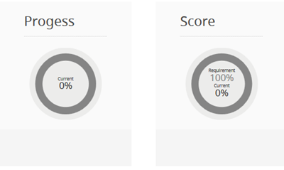
18.Tracking Summary
Although this component appears on the feedback page by default, it can be added to any other page.
...
It does not require configuration.
Questionnaire
A questionnaire consists of:
...
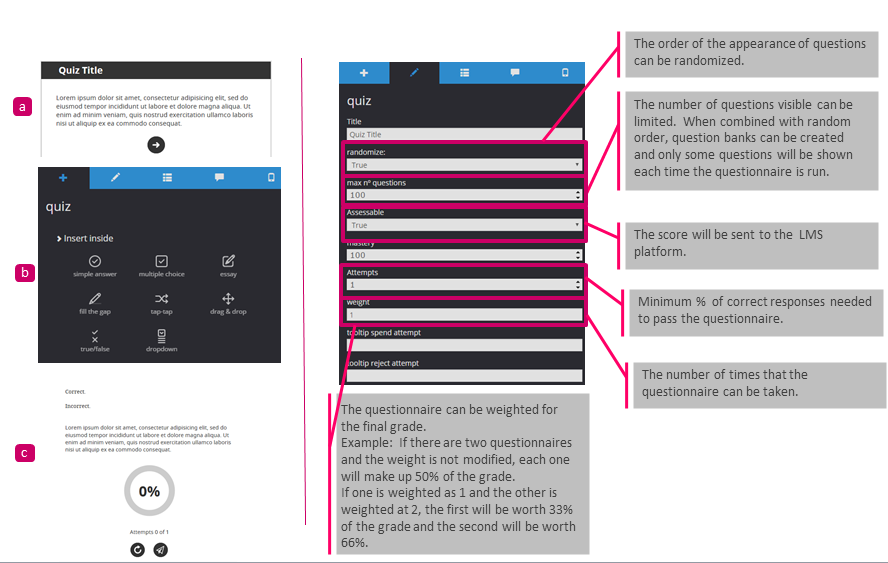
Questionnaire>> Questions
Different types of questions can be added to questionnaires. There are 8 available types.
All questions have the same configuration parameters.
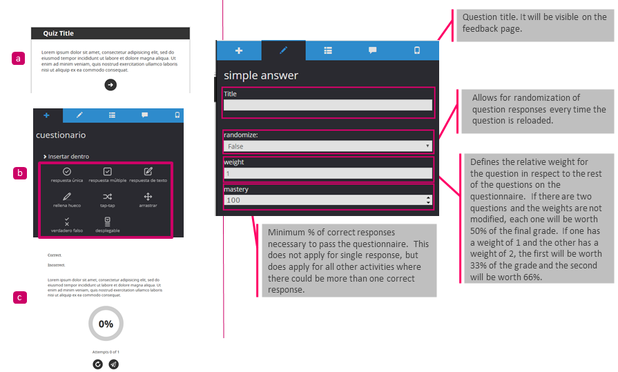
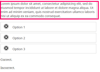
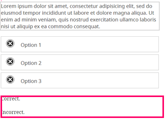
Questionnaire>> Questions. // 1. Single Response
Consists of:
- A statement
- Options
- Positive and negative feedback
 |
| Text, images, audio, and video can be added to the statement. |
|
| Text and/or images can be added to each response option. More response options can be added. The correct option is indicated under properties, and the selection button can be aligned on the left or the right.. |
| Positive and negative feedback associated with the question. Free text. |

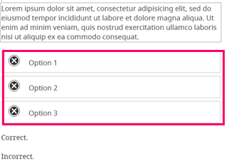
Questionnaire>> Questions. // 2. Multiple Choice
It is configured in the same way as the simple Response.
The only difference is that there can be two or more correct options.
- Text, images, audio, and video can be added to the statement.
- Text and/or images can be added to each response option.
- More response options can be added.
- Positive and negative feedback associated with the question. Free text.
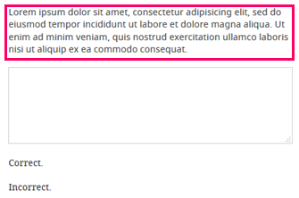
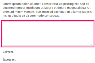
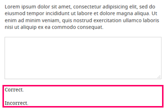
Questionnaire>> Questions. // 3. Text Response
| Text, images, audio, and video can be added to the statement. |
| Text field where the student writes. It does not have properties. Only one per activity can be added. |
| Positive and negative feedback associated with the question. Free text. |

Questionnaire>> Questions. // 4. Fill-in-the-Blank
1.Place the cursor on the text in the position where the blank should be created.
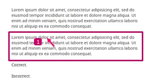
2.Select the “Fill-in-the-Blank Option” component in the editor.

3.Under the properties of the blank created, indicate which is the correct text and give a title to the blank (optional).

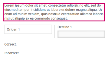
Questionnaire>> Questions. // 5. Matching
Consists of relating a source to a destination using arrows.
This is the basic configuration, but new components can be added.
|
| Text, images, audio, and video can be added to the statement.. |
|
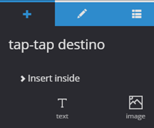
| New sources and destinations can be added. Text and images can be added within a source or destination.. |


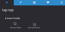
ASSEMBLY PROCEDURE
Select each destination, and under properties, give each a title.
...
Then select the source, and under properties, indicate which destination it matches with.

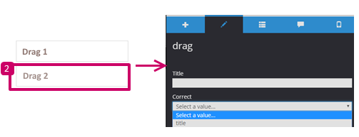
Questionnaire>> Questions. // 6. Drag and Drop
Consists of dragging a source to a destination.
...
|
| Text, images, audio, and video can be added to the statement. |
|
| New sources and destinations can be added. Text and images can be added within a source or destination. |

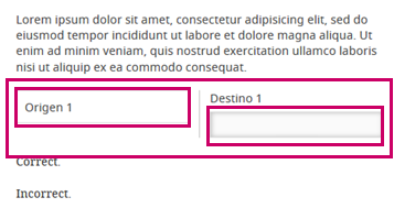
ASSEMBLY PROCEDURE
Select each destination, and under properties, give each a title.
...
It is optional to give it a title.
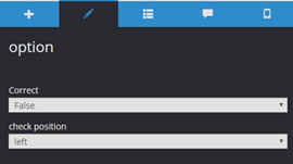
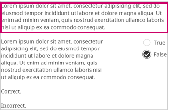
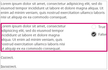
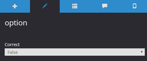
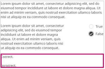
Questionnaire>> Questions. // 7. True/False
|
| Text, images, audio, and video can be added to the statement. |
|
| Response option. Text or images can be added within each option. New response option can be added later. For each response option, under properties, indicate if the statement is true or false. |
| Positive and negative feedback associated with the questions. Free text. |

Questionnaire>> Questions. // 8. Drop-Down
ASSEMBLY PROCEDURE
1. Place the cursor in the text where the blank will be created.
...