Version learningCloud Mobile Apollo 3.0 (02/10/2017)
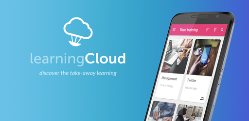
Introducing our latest release for learningCloud Mobile 3.0, we’ve completely redesigned the user experience with a mobile-first approach.
At Netex we work under the premise that less is more, for that reason the new Apollo version shows the information you need in a clear concise way, optimized for mobile devices.
![]() Contextual help
Contextual help
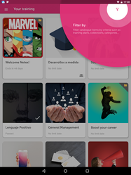
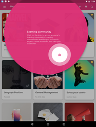
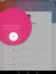
So, you don’t miss a thing! The first time you access the application or there are new features that you haven’t seen yet, we will help you discover them through explanatory popups.
![]() New look&feel
New look&feel
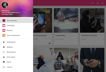
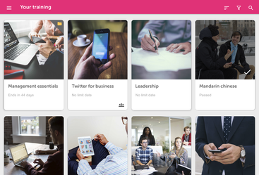
Information is now presented in card format that highlights available courses and training plans.
Select a course or plan to see the training resources contained within the digital card
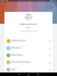
Swipe the screen to see more details such as validity dates, completion requirements or go straight to course material and start the training.
The progress bar will show your progress and how much is left to finish on the course.
By downloading training content, you can view them without Internet connection at a more convenient time.
You can select which individual material to download, or download them all at the same time.
The new download manager, fully integrated with the operating system, will notify you when the download is complete and you can open the material directly.
Access the catalogue and view the training offered by your company. Sorting, filtering and search options are always visible in the upper bar and will help you find the courses and plans that interest you.
![]() Smooth effects and transitions
Smooth effects and transitions
We believe that the quality of the application and user experience should be excellent.
That’s why we have added effects and small animations that help deliver a consumer-grade mobile learning experience.
